Color has a profound impact on how people feel, perceive, and respond to the environments around them. Nowhere is this more crucial than in healthcare spaces, where patients, families, and staff alike experience a wide range of emotions—from fear and uncertainty to hope and relief. The design and color palette of a healthcare facility play a subtle but significant role in patient experience and healing outcomes, staff performance, and overall functionality.
When used intentionally, color can help reduce anxiety, improve patient satisfaction, and even contribute to more efficient clinical workflows. But when misapplied, the wrong colors can amplify stress, confuse wayfinding, and make already difficult experiences feel even more isolating. Here’s a look at how color psychology works in healthcare environments—and what designers, administrators, and healthcare architects need to know about what works, and what doesn’t.
Why Color Matters in Clinical Settings
Healthcare environments are inherently high-stress. Patients are often anxious or in pain, and staff are navigating tight schedules, emotional strain, and physical exhaustion. In this context, every design decision—including color—matters.
Color affects people on both a psychological and physiological level. Research shows that certain colors can influence heart rate, blood pressure, and stress levels. For example, warm colors like red and orange tend to be stimulating and energizing, while cooler hues like blue and green are associated with calmness and relaxation. While these reactions are partly culturally informed, they are also rooted in biology.
In healthcare design, colors must support a facility’s function: promoting healing, reducing stress, encouraging clarity and communication, and creating environments where patients and staff feel safe and supported.
Sign up to get the latest industry news and offers right in your inbox
What Works: Calming, Healing, and Functional Colors
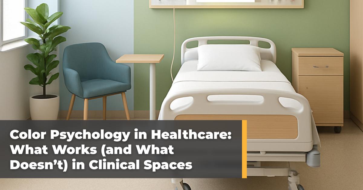
Soft blues and greens consistently perform well in patient rooms, waiting areas, and corridors. Blue tones, especially those with a gray or muted base, are associated with tranquility, trust, and stability—making them ideal for spaces where patients are nervous or vulnerable. Green, often linked with nature and renewal, supports a sense of healing and reduces eye strain, making it a good choice for areas where long focus or patient observation occurs.
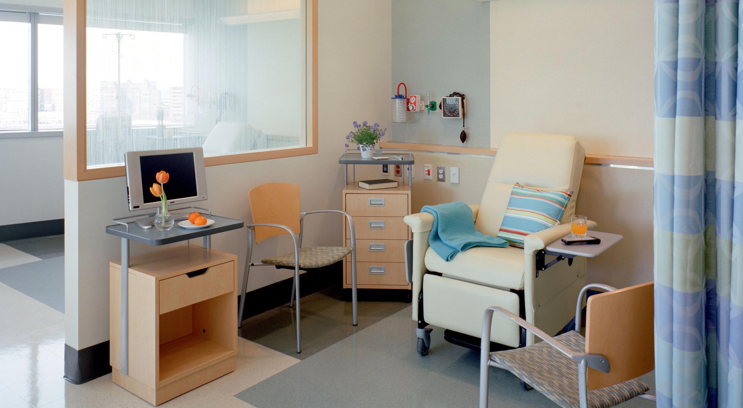
Warm, muted neutrals like taupe, sand, and soft grays create a sense of grounding and comfort. These earth tones serve as a non-distracting backdrop for brighter accents and can help a space feel residential rather than institutional. This is particularly important in outpatient clinics or long-term care settings, where the goal is to reduce the sterility often associated with hospitals.

Palettes inspired by natural elements—such as soft sky blue, leafy green, stone gray, and warm wood browns—can have a biophilic effect. Champion’s Pebble Trail and Sea of Clouds are perfect examples of how designers can bring nature’s beauty into clinical spaces. Incorporating these award-winning palettes helps to reconnect individuals with nature, which has been shown to reduce stress and improve healing outcomes. When paired with natural light and materials like wood or stone, nature-inspired colors can transform even a small exam room into a more welcoming space.
Read More: “Healthcare Design Trends: Creating Healing Environments
For Patients and Staff”
Using different color zones to indicate departments, pathways, or function-specific areas (e.g., pediatrics vs. oncology) helps patients navigate complex facilities. This technique reduces confusion and anxiety, especially for elderly patients or those unfamiliar with medical environments. But for color zoning to be effective, it needs to be intuitive, consistent, and balanced with legible signage and lighting.
Pops of brighter color—such as cheerful yellows or oranges—can be used to energize and uplift without overwhelming. These should be applied thoughtfully in spaces like pediatric clinics, therapy gyms, or cafeterias. When done strategically, these accent hues can enhance engagement and positivity without compromising the overall calming tone of the space.
What Doesn’t Work: Design Mistakes That Disrupt Healing Environments
While cleanliness is paramount in healthcare, sterile white environments can feel cold, impersonal, and anxiety-inducing. Overusing white and stark neutrals—particularly without texture, pattern, or warmth—can make patients feel exposed or uncomfortable. It may also cause light reflection that leads to eye strain or fatigue, especially in operating rooms and treatment spaces.
Colors like deep reds, vivid oranges, or bright purples can be overwhelming or even agitating in clinical contexts. While they may be appropriate in moderation, excessively bold or saturated colors can increase heart rate, trigger stress responses, or cause sensory overload—especially for patients with autism, PTSD, or neurological sensitivities.
Color choices must match the function of a space. A cool gray palette might be great for a surgical suite but too somber for a pediatric oncology clinic. Similarly, bright colors in a behavioral health setting can be overstimulating or distressing. When designers rely too heavily on brand colors or aesthetics without considering behavioral psychology, the result can be a disjointed and ineffective environment.
Read More: “Improving the Patient Experience With Modular Design
Is Good for Business—and Health Outcomes”
Ignoring cultural and individual differences during the design phase could be detrimental to patients. Colors carry different connotations across cultures and age groups. For example, while white may symbolize purity in Western cultures, it can be associated with mourning in others. Designers should be aware of the patient demographics and cultural diversity of their user base and avoid assumptions about color preferences or meanings.
Color should always be used with contextual support because color alone isn’t enough to create a healing environment. Lighting, layout, textures, acoustics, and cleanliness all contribute to how color is perceived and felt. For example, even a well-chosen palette can feel oppressive in a windowless room with harsh fluorescent lighting. Integrating color choices into a holistic design plan is essential.

Tailoring Color to the Purpose of the Medical Space
Different areas within a healthcare facility serve different emotional and functional roles, and color choices should reflect those distinctions.

- Emergency Rooms: Use muted, cool tones to counterbalance the high-stress, high-stakes environment. Avoid aggressive reds or yellows that may elevate anxiety.
- Pediatrics: Incorporate cheerful, age-appropriate colors with whimsical accents—but avoid overwhelming saturation. Use soothing blues and greens as a base.
- Behavioral Health Units: Stick to soft, non-stimulating tones with minimal contrast to create a calming, secure atmosphere. Avoid high-gloss finishes or loud patterns.
- Oncology and Infusion Centers: Prioritize warm neutrals and nature-based palettes to support long stays and emotional vulnerability. Comfort, not clinical cues, should dominate. Champion’s Alō medical recliners offer premium comfort in calming colors that enhance patient experience.
- Staff Areas: Don’t forget about caregivers. Staff lounges and break rooms benefit from energizing but not jarring tones. Soft yellows and balanced greens can foster focus and relaxation.
Color is more than just decoration—it’s a design tool that directly affects behavior, emotion, and experience in healthcare. When used correctly, it supports healing, enhances comfort, and makes healthcare spaces more navigable and humane. But when used without intention, color can undermine all those goals.
By applying color psychology with empathy, strategy, and evidence-based design principles, healthcare environments can become not only more functional—but profoundly more human.
If your facility is planning a remodel or new construction, consider working with healthcare designers who understand the nuances of color in clinical environments. It’s one of the simplest—and most powerful—ways to improve outcomes and experiences across the board.
Champion’s Colorful Array of Premium Fabrics and Finishes
Champion Healthcare Solutions offers a variety of colors in its robust line of fabrics and finishes. These award-winning selections also provide options that tap into biophilia, connecting people with the natural world and bringing this restorative power to healing environments. Champion’s carefully curated palette of materials can create a mood and atmosphere that offers an organic yet modern and sophisticated style for healthcare architects and designers.
Introducing: Champion’s Virtual Chair Configurator
Now you can take the guesswork out of design. With Champion’s new virtual chair configurator, you can explore fabrics, arm styles, add-ons, and finishes to create a custom look that fits your space. Build and preview your chair online, then send your selections directly to our team for expert guidance and a personalized quote.
Try our new virtual chair configurator to see how your chair will look before you buy it.
A Champion team member would be happy to help you evaluate any of our products—contact us today.
